


Skincare clinic transformation.
Laha 2020


The challenge
The existing brand experience was highly fragmented and outdated, and therefore did not resonate with the increasingly younger and more fashionable market.
It became clear to us that Laha needs a full re-brand.
0 — Research
Every project starts by deeply understanding our client. We interviewed the owner, Dr. La Ha and her customers to uncover insights. At the end of our research, we did not only gathered valuable information about the business, but also help their team redefine their missions and core values.
Brand Missions
Brand Values
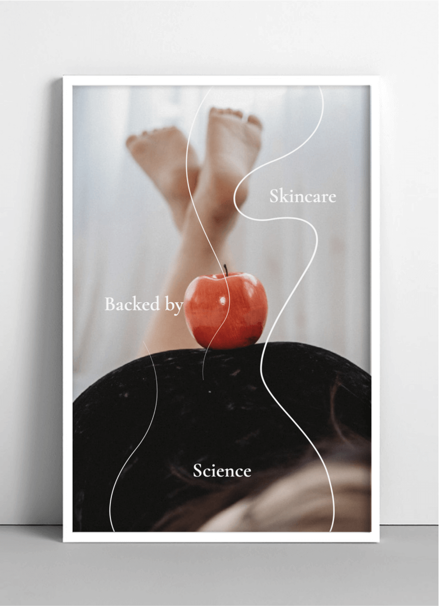
We translated the complex brand DNA into concrete design principles that help guide us along the re-brand process. The delicate balance between these two opposing qualities defined the success of the design.
Functional
- Science & Efficacy
- Clinical
- Scientific
- Expertise & Knowledge
- Premium & Prestige
Emotional
- Nurturing & Sustainable
- Elegant & Sophisticated
- Natural
- Optimistic & Confident
- Vitality & Rejuvenating
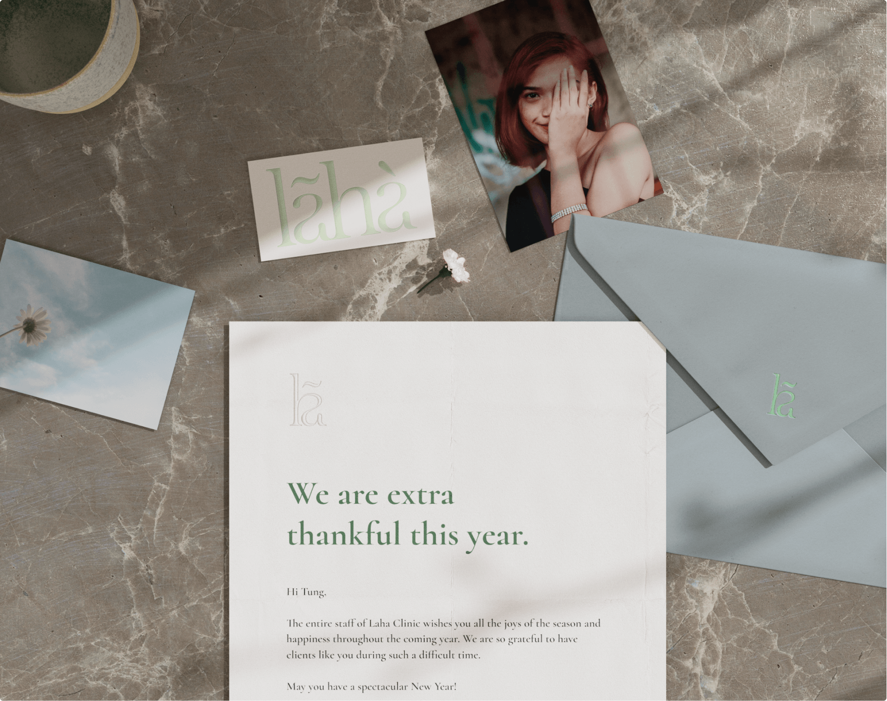
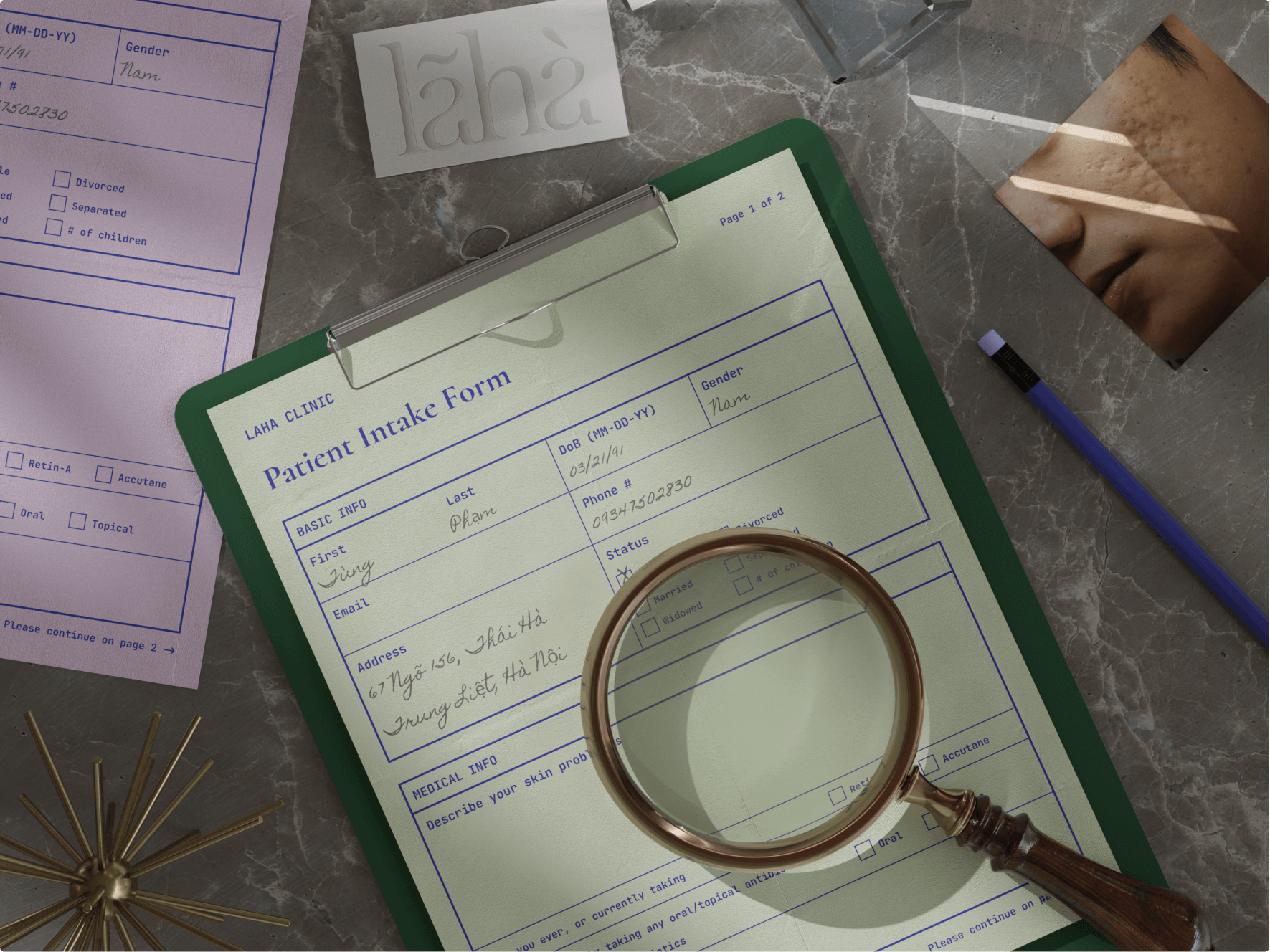
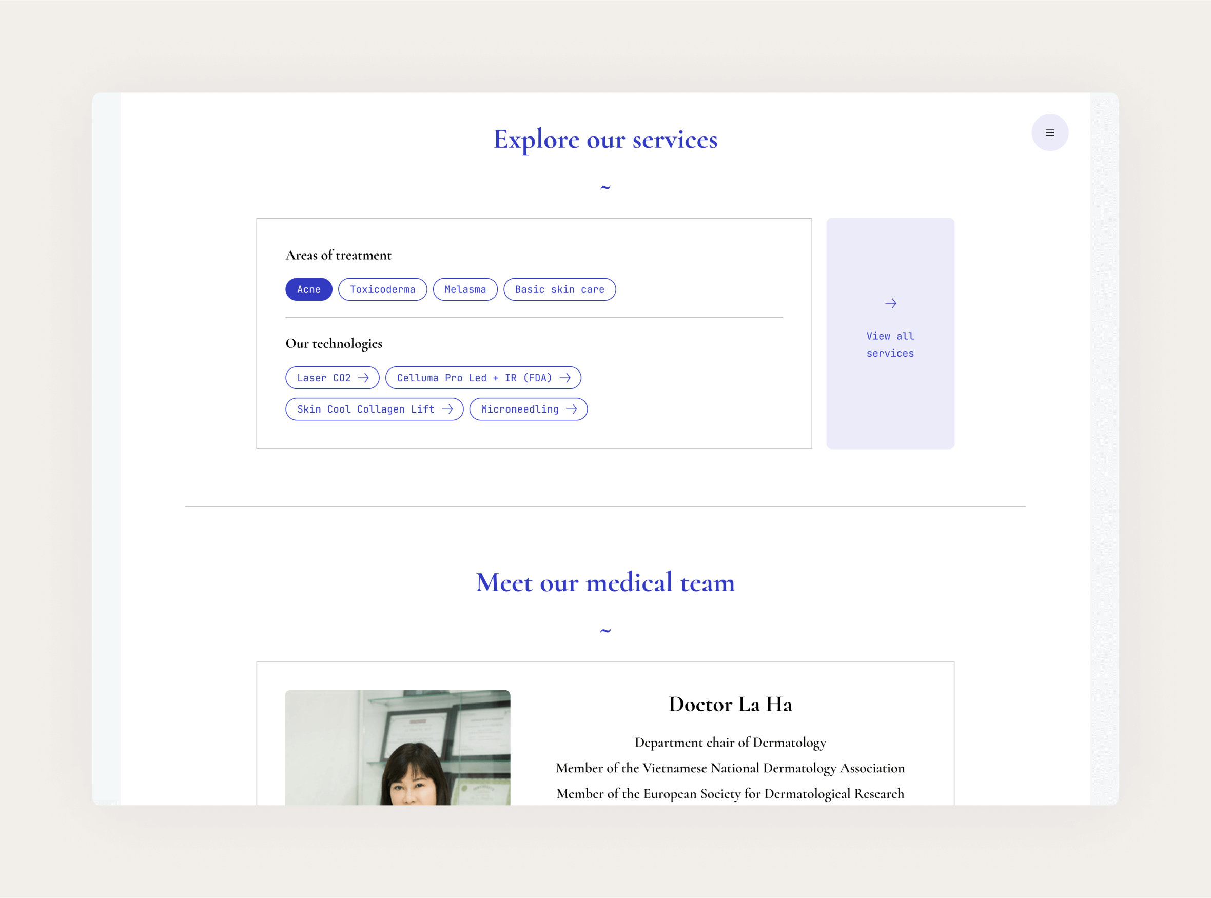
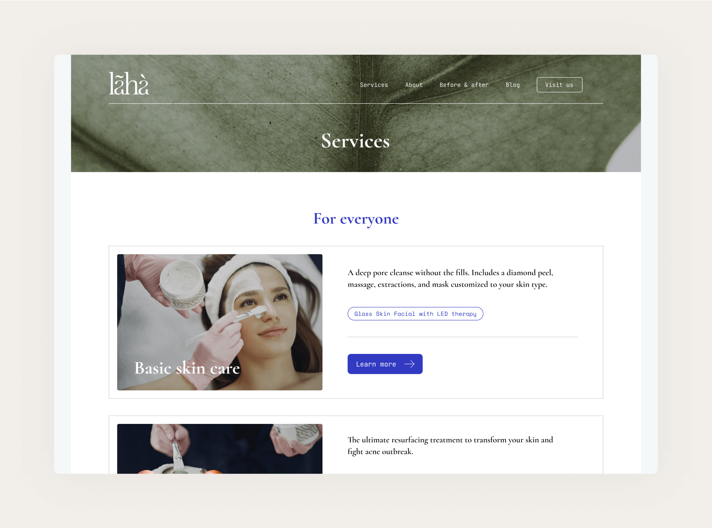
1 — Visual branding

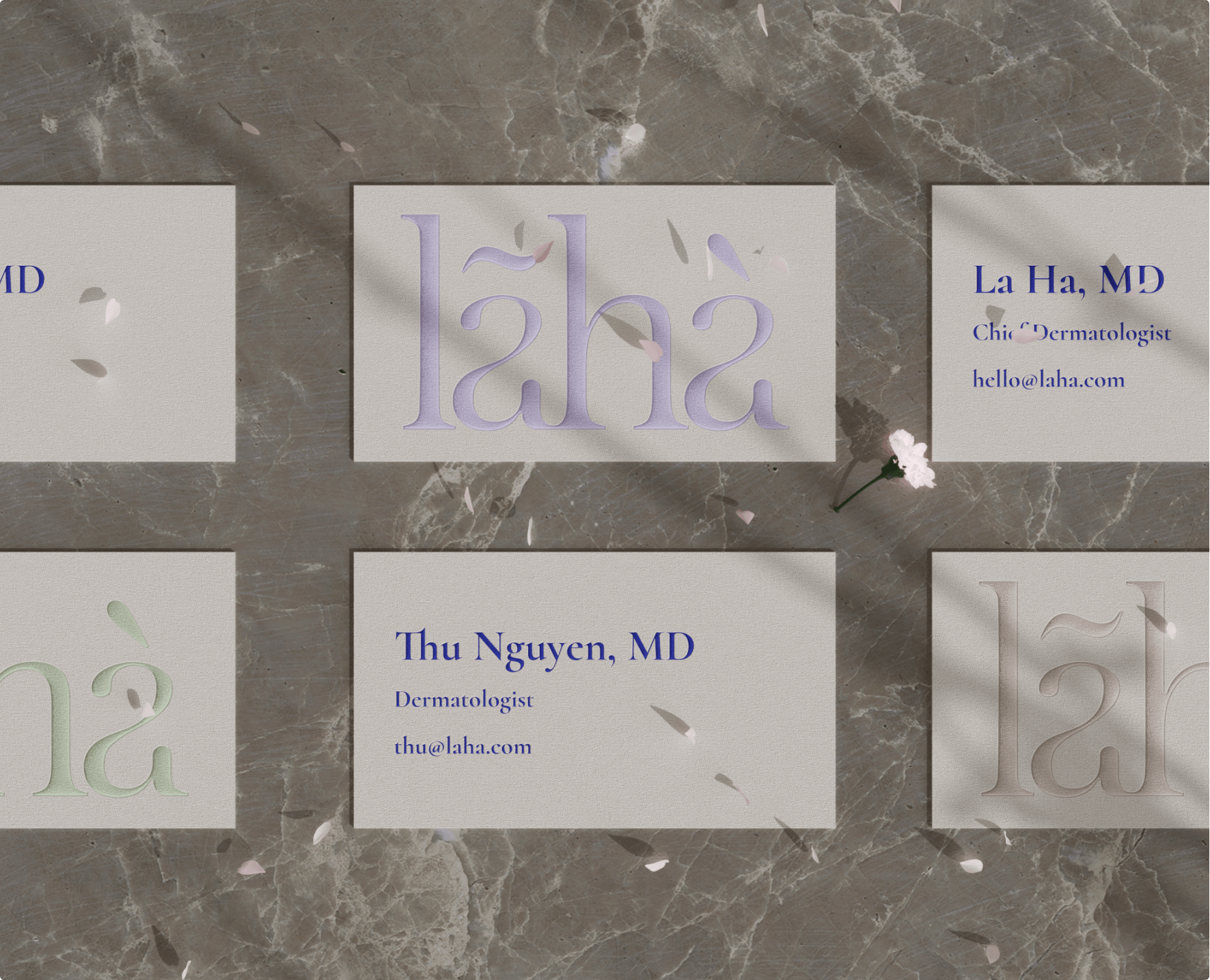
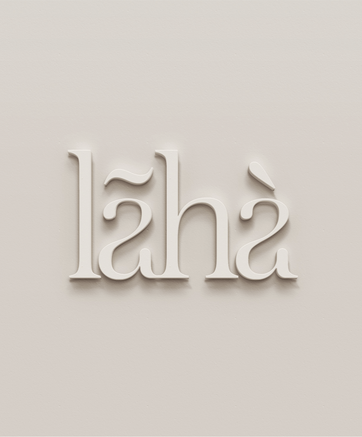
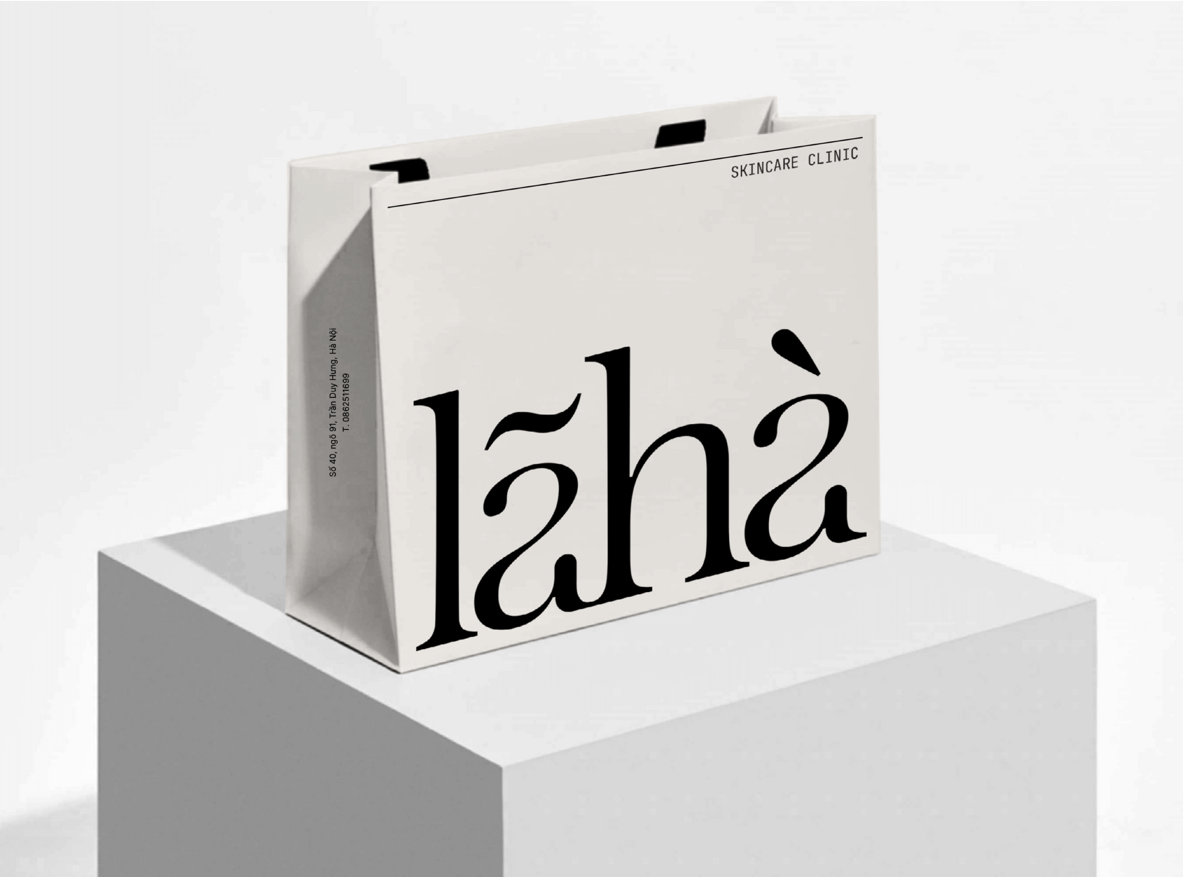
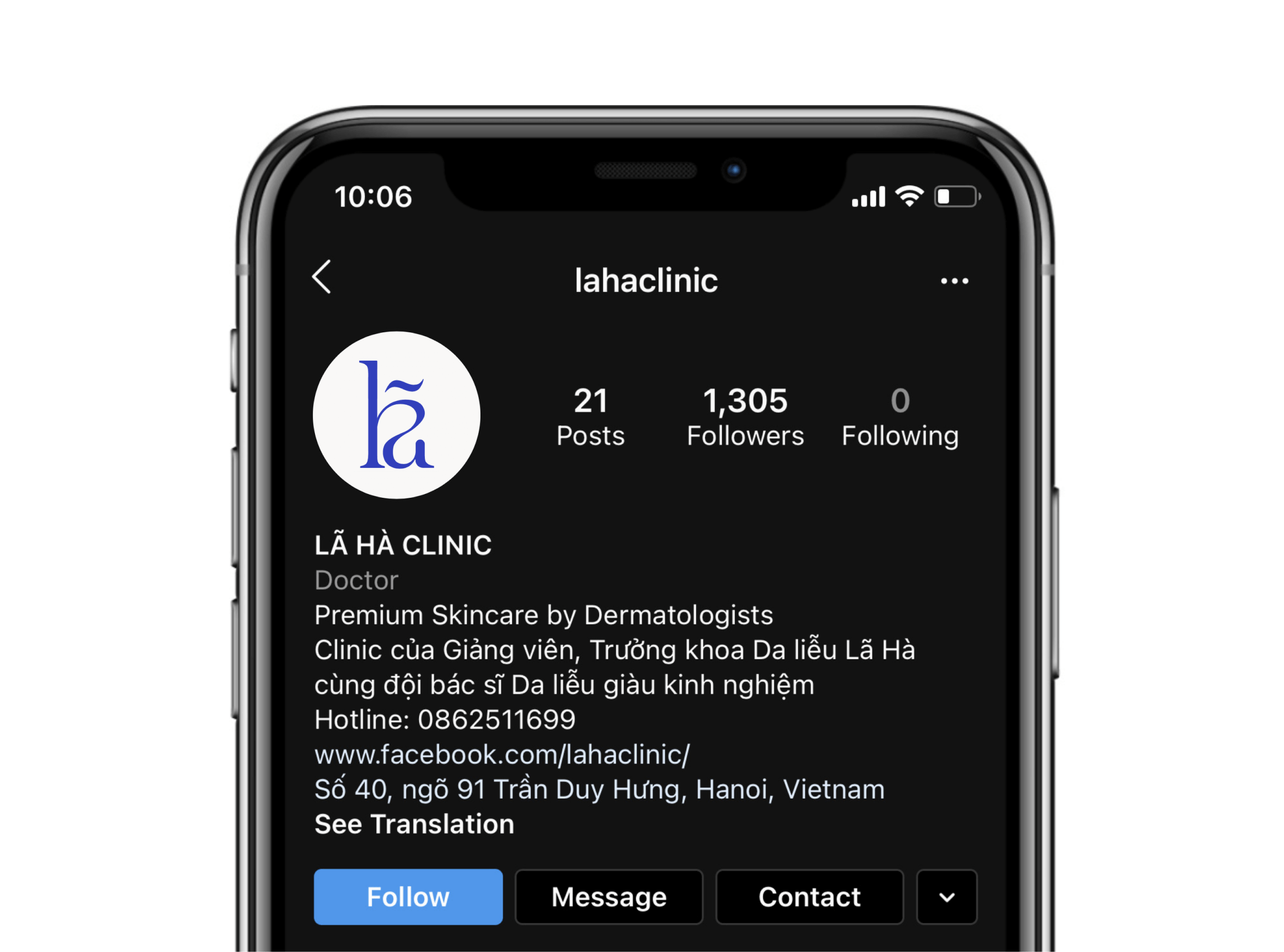
Our custom logo is an evolution from our previous logo with a root to Vietnamese alphabet, while evoking a sense of refreshment through playing with ligatures and diacritics. It constantly juxtaposes the highly premium with youthful contemporariness.


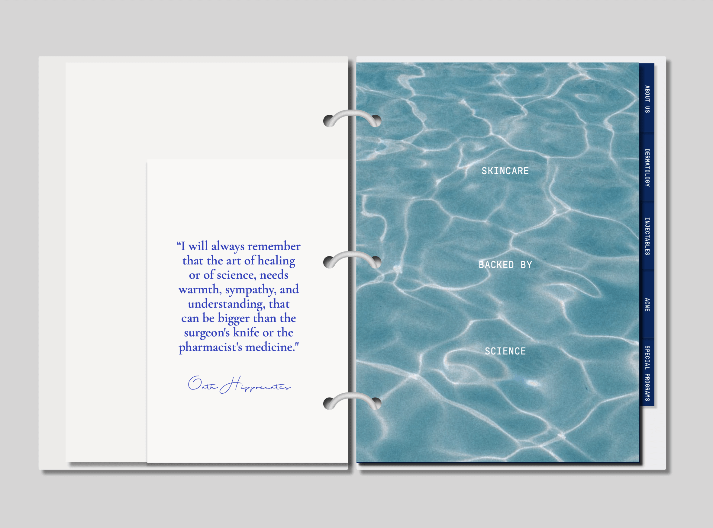
To communicate the brand's affinity to cutting-edge technology, we use a vibrant blue as the primary color.

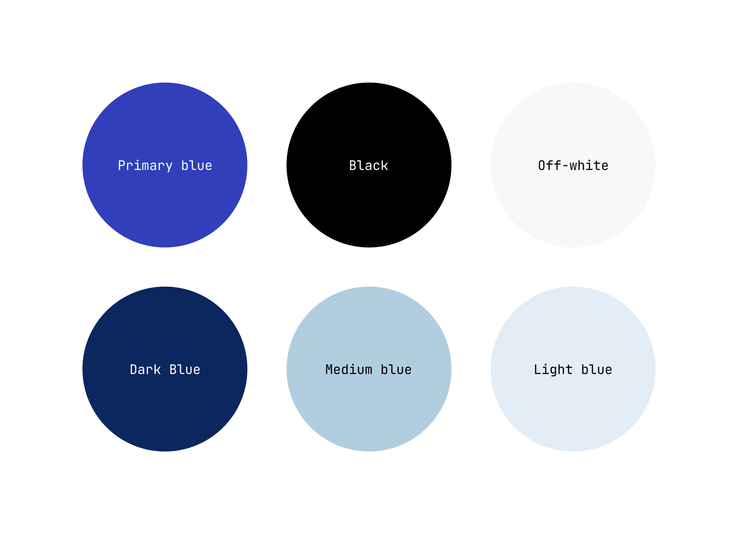
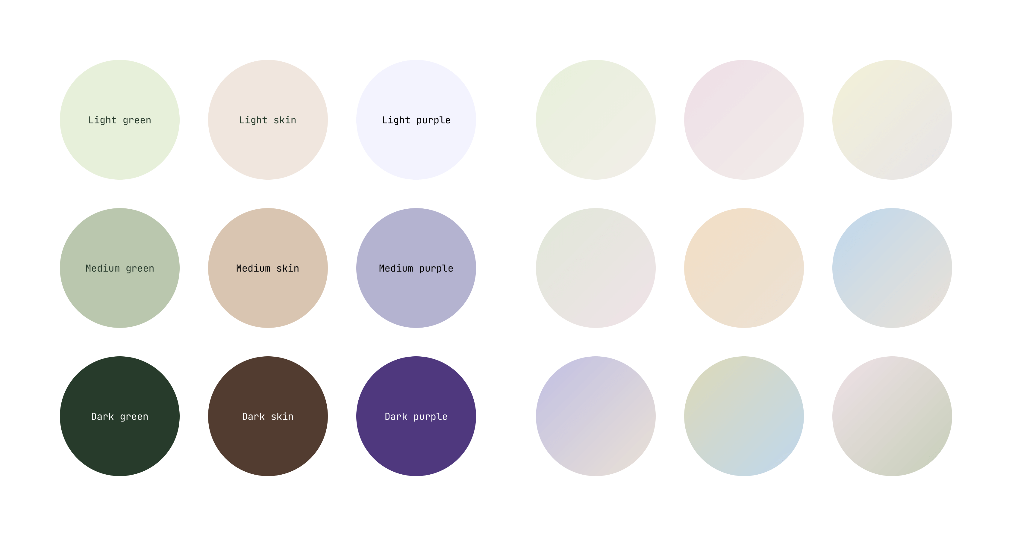
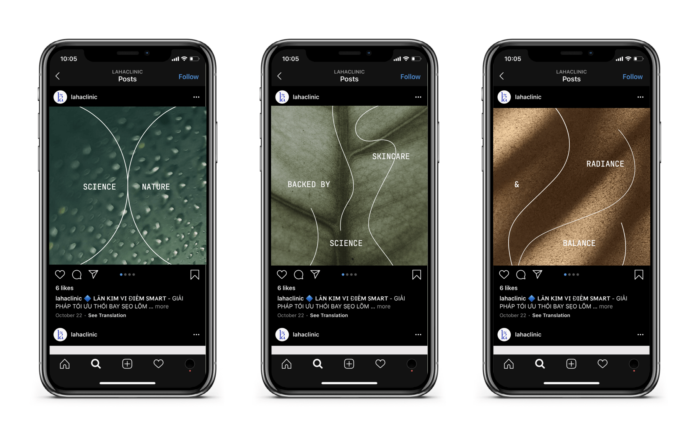
An earthly secondary palette was added to add more nuances to the brands and balance against the technology blue.

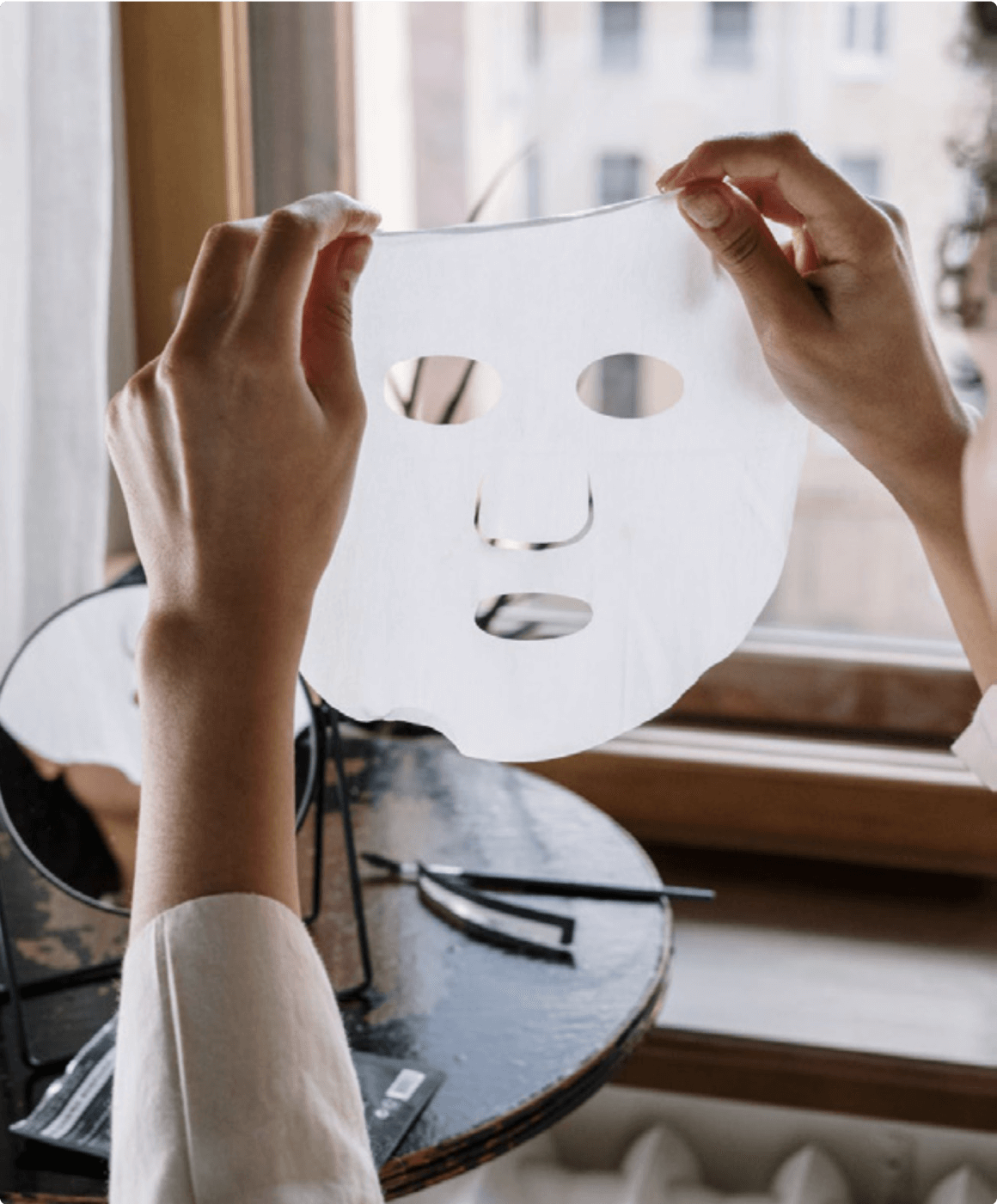
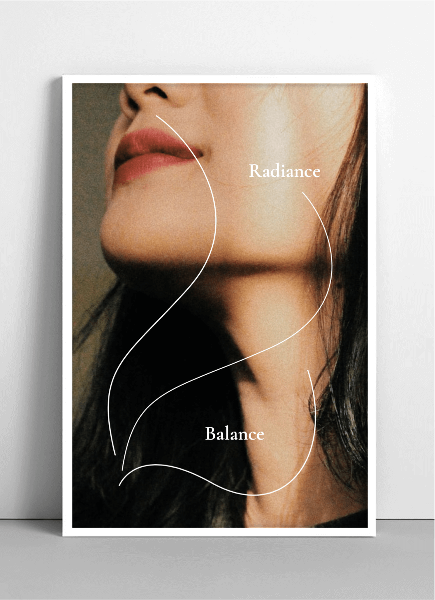
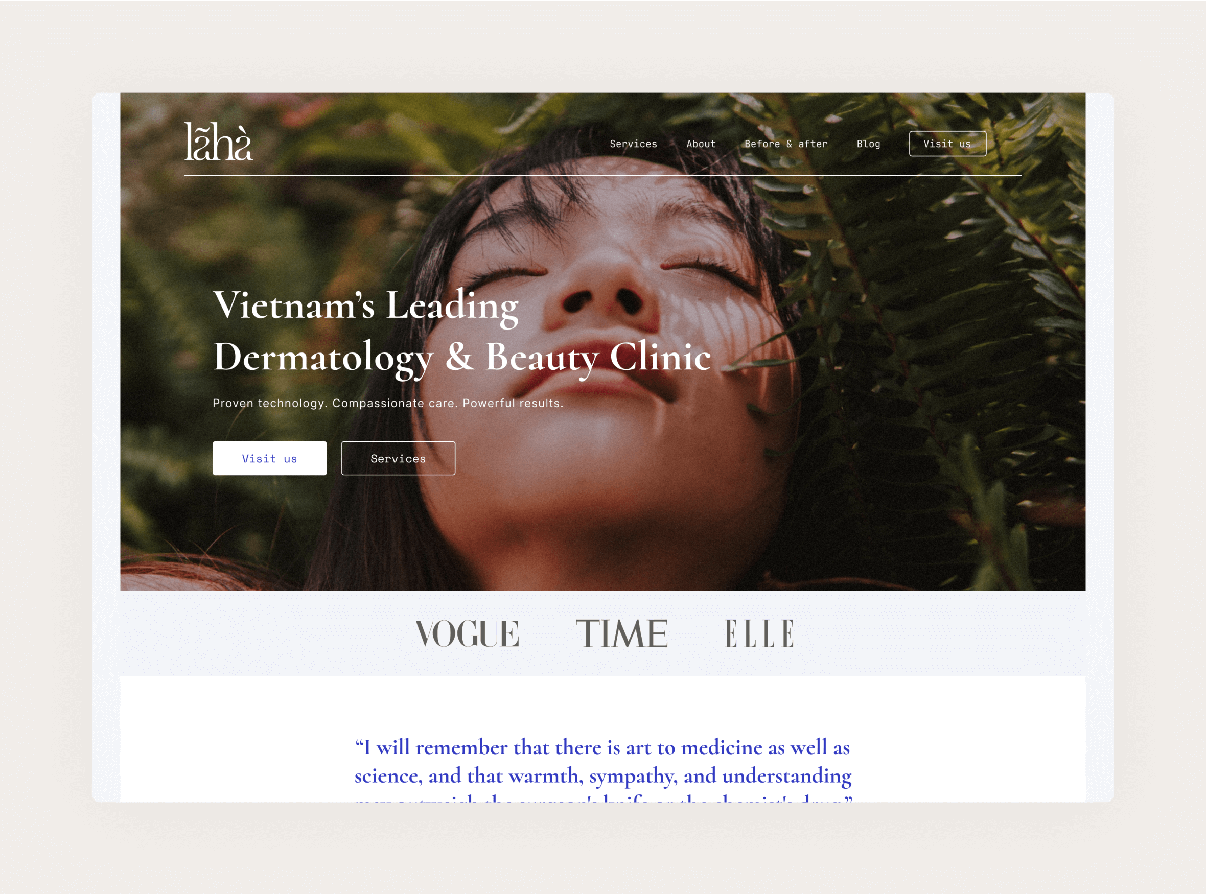
Photography is also a central part of the brand experience. The dichotomy between function vs emotion, technology vs human, sublimity vs tenderness plays out in two distinct sets of photography - texture vs human.


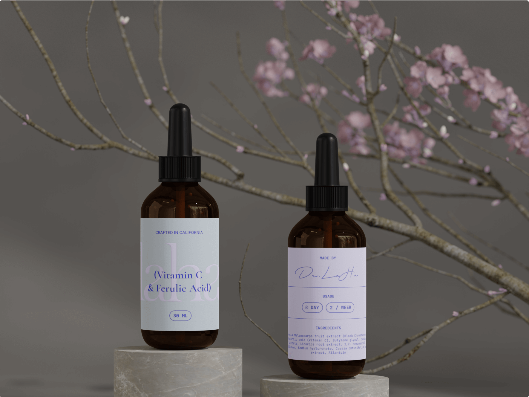
2 — Physical products


3 — Digital experience

After downloading the application, users can already browse listing without signing up. This lower the barrier to entry and enable users to get values out of the application immediately. The sign up experience is extremely simple with only a few basic questions. Users will then go through a phone verification to guarantee maximum security.